2023-11-26-achievements
Updated on: 2024-02-26 14:30:01
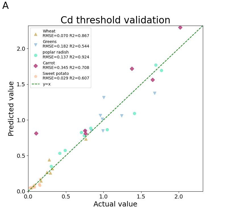
帮助史良老师绘制5中作物可食用部分中镉含量预测模型的准确性—-1:1图。
代码如下。
import numpy as np
from sklearn.metrics import mean_squared_error
from sklearn.metrics import r2_score
from matplotlib import pyplot as plt

y_obs1 = np.array([0.249, 0.293, 0.319, 0.764, 0.170, 0.280,
])
y_pred1 = np.array([0.267, 0.259, 0.316, 0.733, 0.146, 0.443
])
y_obs2 = np.array([0.959, 1.241,1.677 ,0.991 ,0.836 ,0.758 ,0.984 ,1.001
])
y_pred2 = np.array([1.064, 1.059, 1.374, 0.847, 0.854, 0.849, 1.010, 1.314,
])
y_obs3 = np.array([1.694, 0.706, 0.741, 0.491, 1.047, 0.829, 1.409, 0.419, 0.306, 1.770,
])
y_pred3 = np.array([1.770, 0.825, 0.779, 0.573, 0.866, 0.885, 1.090, 0.533, 0.351, 1.694,
])
y_obs4 = np.array([0.106, 0.753, 0.762, 1.375, 1.652, 2.016,
])
y_pred4 = np.array([0.811, 0.847, 0.810, 1.719, 1.563, 2.295,
])
y_obs5 = np.array([0.022, 0.066, 0.082, 0.038, 0.039, 0.083, 0.161, 0.055, 0.073, 0.154, 0.147,
])
y_pred5 = np.array([0.049, 0.063, 0.085, 0.049, 0.043, 0.058, 0.169, 0.057, 0.065, 0.081, 0.097,
])
y_obs = np.concatenate([y_obs1.flatten(), y_obs2.flatten(), y_obs3.flatten(), y_obs4.flatten(), y_obs5.flatten()])
y_pred = np.concatenate([y_pred1.flatten(), y_pred2.flatten(), y_pred3.flatten(), y_pred4.flatten(), y_pred5.flatten()])
RMSE1 = np.sqrt(mean_squared_error(y_obs1, y_pred1))
RMSE2 = np.sqrt(mean_squared_error(y_obs2, y_pred2))
RMSE3 = np.sqrt(mean_squared_error(y_obs3, y_pred3))
RMSE4 = np.sqrt(mean_squared_error(y_obs4, y_pred4))
RMSE5 = np.sqrt(mean_squared_error(y_obs5, y_pred5))
R21 = r2_score(y_obs1, y_pred1)
R22 = r2_score(y_obs2, y_pred2)
R23 = r2_score(y_obs3, y_pred3)
R24 = r2_score(y_obs4, y_pred4)
R25 = r2_score(y_obs5, y_pred5)

def yyplot(y_obs1, y_pred1, y_obs2, y_pred2, y_obs3, y_pred3, y_obs4, y_pred4, y_obs5, y_pred5):
    yvalues = np.concatenate([y_obs.flatten(), y_pred.flatten()])
    ymin, ymax, yrange = np.amin(yvalues), np.amax(yvalues), np.ptp(yvalues)
    fig = plt.figure(figsize=(8, 8))
    plt.scatter(y_obs1, y_pred1, c='#D1B063', marker='^', s=50, alpha=0.8)
    plt.scatter(y_obs2, y_pred2, c='#90BEDE', marker='v', s=50, alpha=0.8)
    plt.scatter(y_obs3, y_pred3, c='#68EDC6', marker='o', s=50, alpha=0.8)
    plt.scatter(y_obs4, y_pred4, c='#B33475', marker='D', s=50, alpha=0.8)
    plt.scatter(y_obs5, y_pred5, c='#FFC5A1', marker='p', s=50, alpha=0.8)
    plt.plot([ymin - yrange * 0.01,ymax + yrange * 0.01], [ymin - yrange * 0.01,ymax + yrange * 0.01], c = "g",linestyle ="--") # 画一条直线
    plt.xlim(ymin - yrange * 0.01, ymax + yrange * 0.01) # 设置x轴的范围
    plt.ylim(ymin - yrange * 0.01, ymax + yrange * 0.01) # 设置y轴的范围
    plt.xlabel('Actual value', fontsize=18)
    plt.ylabel('Predicted value', fontsize=18)
    plt.title('Cd threshold validation', fontsize=24)
    plt.tick_params(labelsize=14)
    #plt.annotate('RMSE=%.3f' % RMSE, xy=(0.04, 0.93), xycoords='axes fraction', fontsize=14)
    #plt.annotate('R2=%.3f' % R2, xy=(0.04, 0.89), xycoords='axes fraction', fontsize=14)
    #fig.suptitle('A', fontsize=24, x=0.01, y=0.95, horizontalalignment='left', va='bottom')
    plt.legend(['Wheat\nRMSE=%.3f R2=%.3f' %(RMSE1,R21), 'Greens\nRMSE=%.3f R2=%.3f' %(RMSE2,R22),
                'poplar radish\nRMSE=%.3f R2=%.3f' %(RMSE3,R23),
                'Carrot\nRMSE=%.3f R2=%.3f' %(RMSE4,R24), 'Sweet potato\nRMSE=%.3f R2=%.3f' %(RMSE5,R25),'y=x'], loc='upper left', fontsize=10)
    plt.show()

    return fig
fig = yyplot(y_obs1, y_pred1, y_obs2, y_pred2, y_obs3, y_pred3, y_obs4, y_pred4, y_obs5, y_pred5)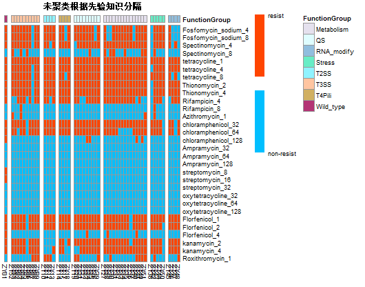
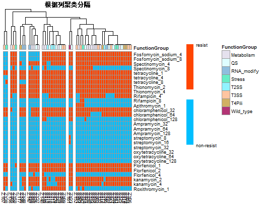
帮助唐老板绘制complex-heatmap两张。
附上R语言代码如下:
library(pheatmap)
library(RColorBrewer)
setwd('E://R语言学习文件/')
dataset <- read.csv("antibiotic1.csv",header = TRUE, row.names= 1)
tdata <- t(dataset)
annotation<- read.csv("annotation_t.csv",header = TRUE, row.names= 1)
ann_colors =
list(FunctionGroup = c(Metabolism="#E5E1EE",
                     QS="#DFFDFF",
                     RNA_modify="#90BEDE",
                     Stress="#68EDC6",
                     T2SS="#90F3FF",
                     T3SS="#FFC5A1",
                     T4Pili="#D1B063",
                     Wild_type="#B33475"))
manual_culster =  c("Wlid_type",
                    rep(c("T3SS"),10),
            rep("metabolism",15),
            rep("T4Pili",4),
            rep("QS",9),
            rep("T2SS",4),
            rep("RNA_modify",4),
            rep("Stress",5),
            ) #根据先验知识进行手动聚类

pheatmap(tdata,#表达数据
         #display_numbers = F, #  矩阵的数值是否显示在热图上
         #number_format = "%.2f", # 单元格中数值的显示方式
         #fontsize_number = 8, #  显示在热图上的矩阵数值的大小,默认为0.8*fontsize
         cluster_rows = F,#行聚类
         cluster_cols = F,#列聚类
         clustering_method = "complete", #表示聚类方法,包括:
         #‘ward’, ‘ward.D’, ‘ward.D2’, ‘single’, ‘complete’, ‘average’, ‘mcquitty’, ‘median’, ‘centroid’
         show_rownames = T,#显示行名
         show_co1names= T,#显示列名
         #scale = "column",#对行标准化'none', 'row' or 'column
         color = c("#00BFFF","white","#FF4500"),#颜色
         legend = T,#显示图例
         legend_breaks = c(0,1),#图例断点显示
         breaks = c(0,0.45,0.55,1),#图例断点
         legend_labels = c("non-resist","resist"), # 图例断点标注的标题
         #cellwidth = 7, cellheight = 4,#调整热图单元格宽度、高度
         #treeheight_row = 30, treeheight_col = 18,#调整行列聚类树的高度
         fontsize =7, fontsize_row = 7, fontsize_col = 7, #热图中字体大小、行、列名字体大小
         main = "根据列聚类分隔", #表示热图的标题名字
         annotation_col = annotation, #添加列注释信息
         #annotation_row = annotation_row, #添加行注释信息
         annotation_1egend=T,#显示样本分类
         annotation_colors =ann_colors,#设置行注释颜色
         cutree_rows=3,cutree_cols=7,#根据行列的“聚类”将热图分隔开
         #gaps_row = c(12, 21),#未进行聚类时手动分割
         #gaps_col = c(1,11,15,19,28,43,48),#未进行聚类时手动分割
         #labels_row = NULL, #使用行标签代替行名
         #labels_col = NULL, #列表签代替列名
)#热图基准颜色超链接:file
这个图只有两个值就是0和1,分别表示细菌对抗生素的抗性有无。因此尤其在色标部分和其他地方不一样,学会了如何设置想要的色标。
实现u盘插入后台获取u盘资料
def steal: